Flexible plans and columns
Add, remove and reorder up to 8 plan columns from the HubSpot editor. Highlight the one you want visitors to notice.

Easy to edit. Built for meaningful comparisons. Build and maintain plan and feature comparisons from the HubSpot editor, without needing a developer every time your plans or features change.
Add, remove and reorder up to 8 plan columns from the HubSpot editor. Highlight the one you want visitors to notice.
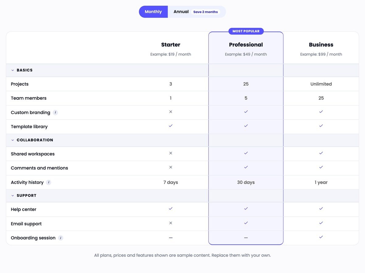
Group features into categories that visitors can collapse and expand, with a check, cross, dash or any text in each cell.
Collapsible categories, row help text and a monthly / annual switch that work with the mouse and the keyboard.
Show different prices and button links for each period. A button appears only when it has a link.
Fonts, colors, borders, spacing, buttons, badge and icons are set from the Styles tab, without code.
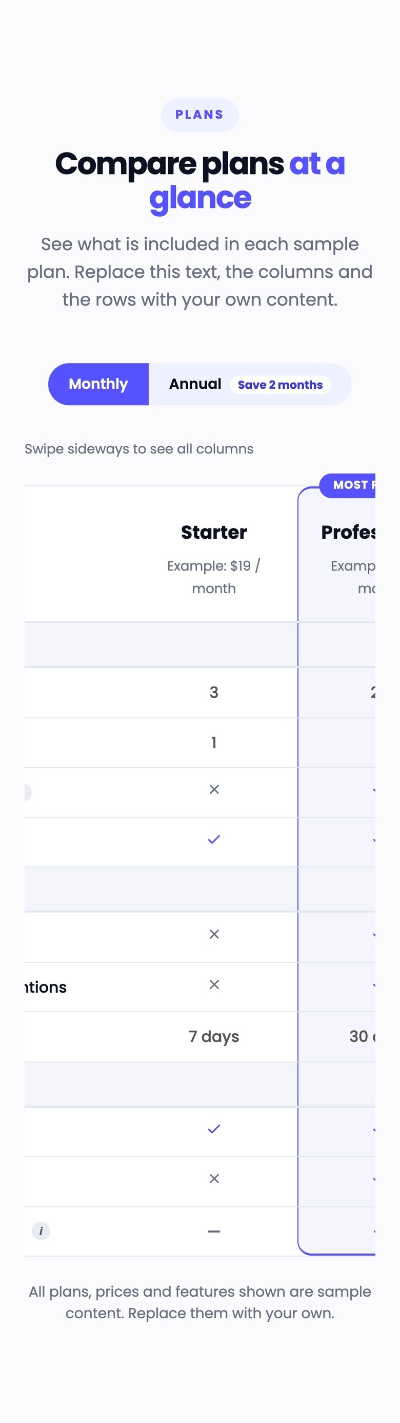
On small screens the table scrolls sideways inside its own area, with a visible hint.
This is a real instance of the module, rendered by HubSpot on this page, with sample content.
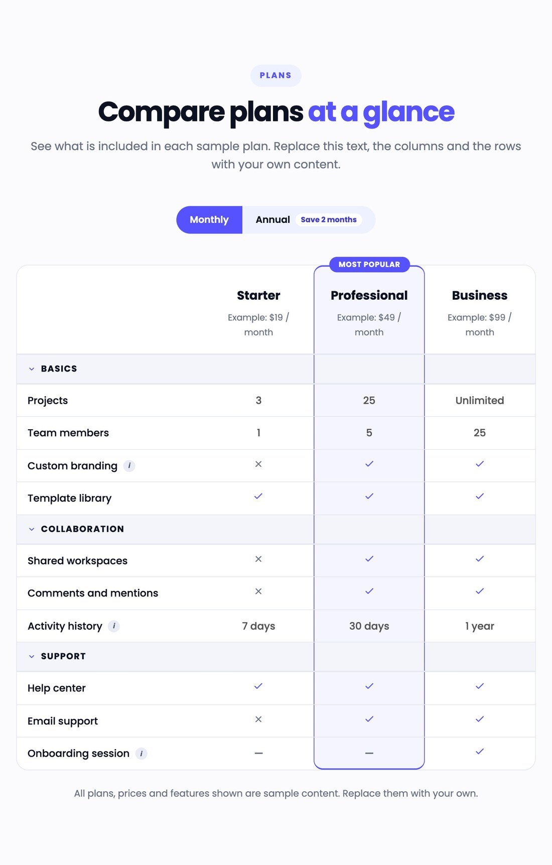
See what is included in each sample plan. Replace this text, the columns and the rows with your own content.
Swipe sideways to see all columns
| Feature |
Starter
Example: $19 / month
Example: $190 / year
|
Professional (Most popular)
Example: $49 / month
Example: $490 / year
|
Business
Example: $99 / month
Example: $990 / year
|
|---|---|---|---|
| Projects | 3 | 25 | Unlimited |
| Team members | 1 | 5 | 25 |
| Custom branding | |||
| Template library | |||
| Shared workspaces | |||
| Comments and mentions | |||
| Activity history | 7 days | 30 days | 1 year |
| Help center | |||
| Email support | |||
| Onboarding session | — | — |
All plans, prices and features shown are sample content. Replace them with your own.
Add, remove and reorder up to 8 plan columns. Each has a name, a subtitle, monthly and annual prices, and an optional button with its own monthly and annual link. A button appears only when it has a link. No code needed.
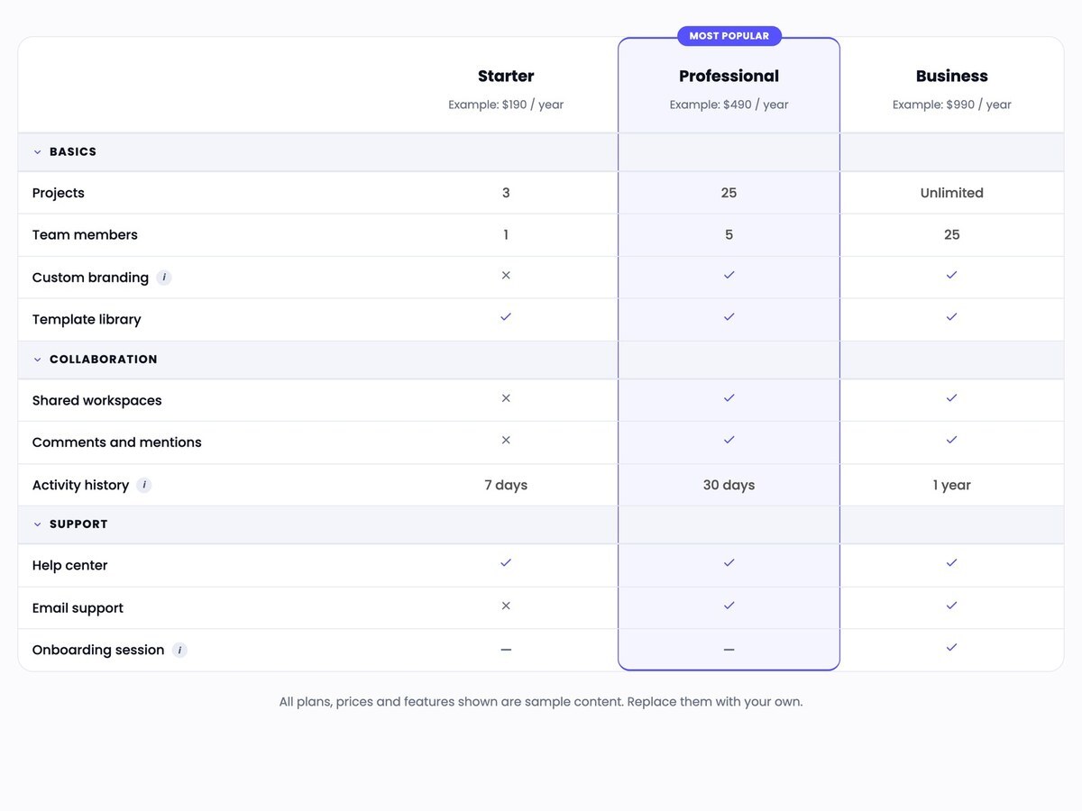
Make one or more columns stand out with a colored background and border, plus an optional badge such as Most popular. Choose the badge text and its colors.
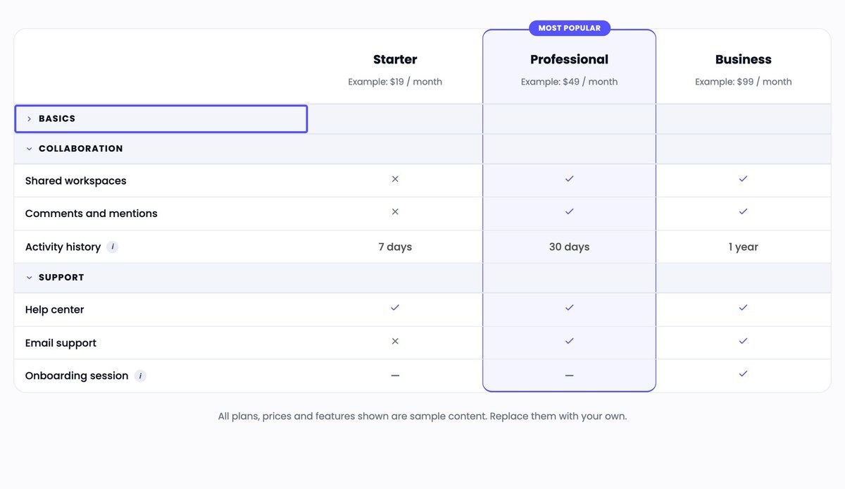
Group rows into categories that visitors can open and close with the mouse or the keyboard. Each category can have its own icon.
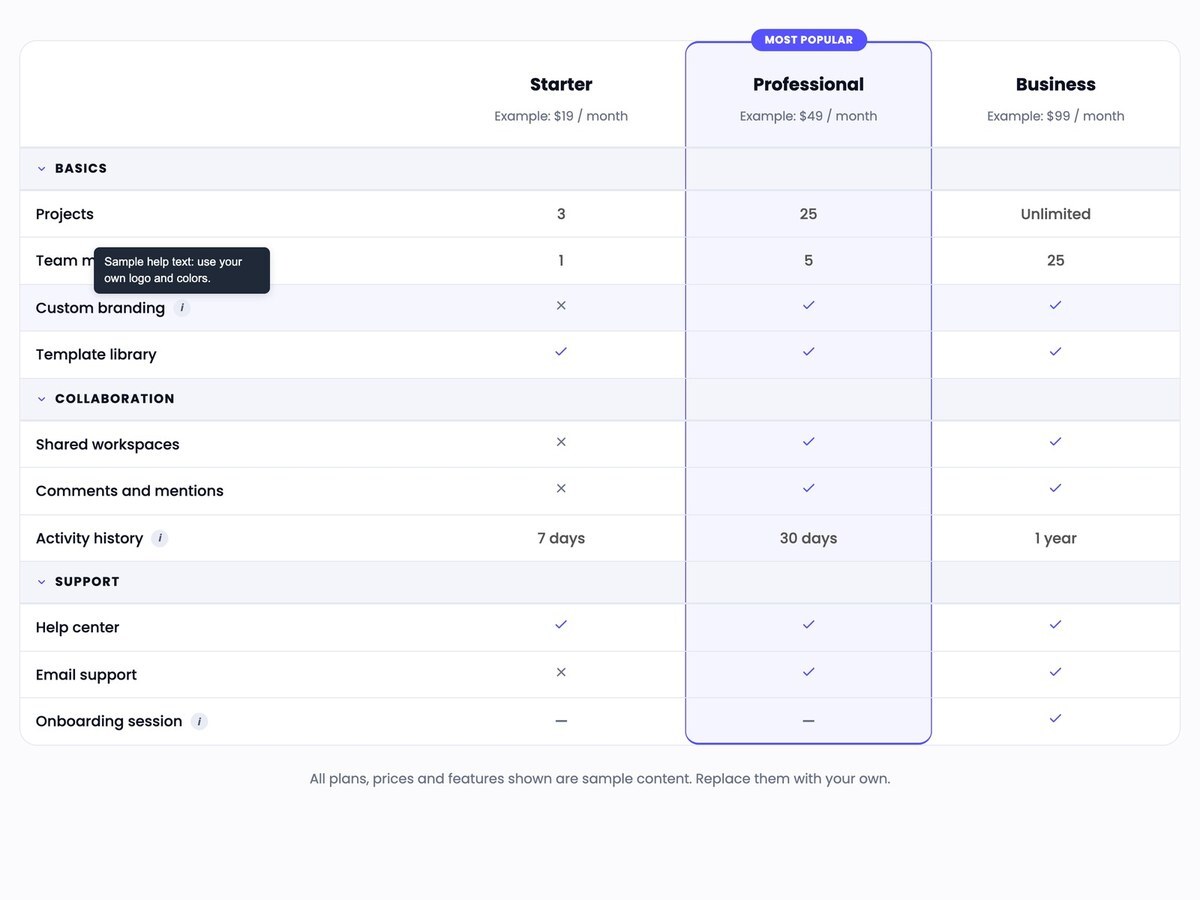
Show a check, a cross, a dash or any text in each cell. Add optional help text to a row; it appears as a tooltip on hover and on keyboard focus.
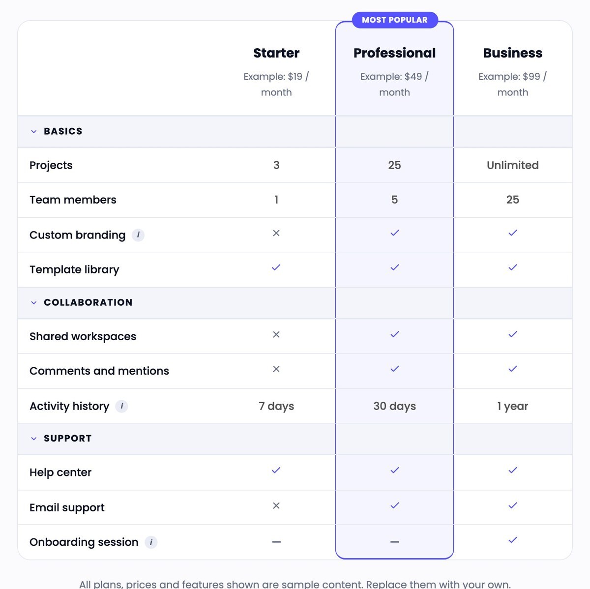
Uses a real HTML table with labeled headers, scrolls sideways on small screens with a visible hint, and supports keyboard use with a clear focus outline.
Real captures of the module running in HubSpot, with its sample content.
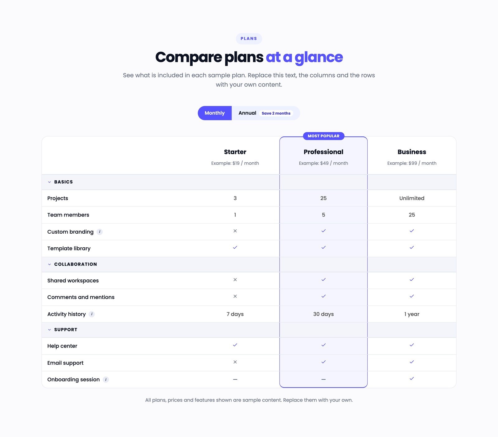
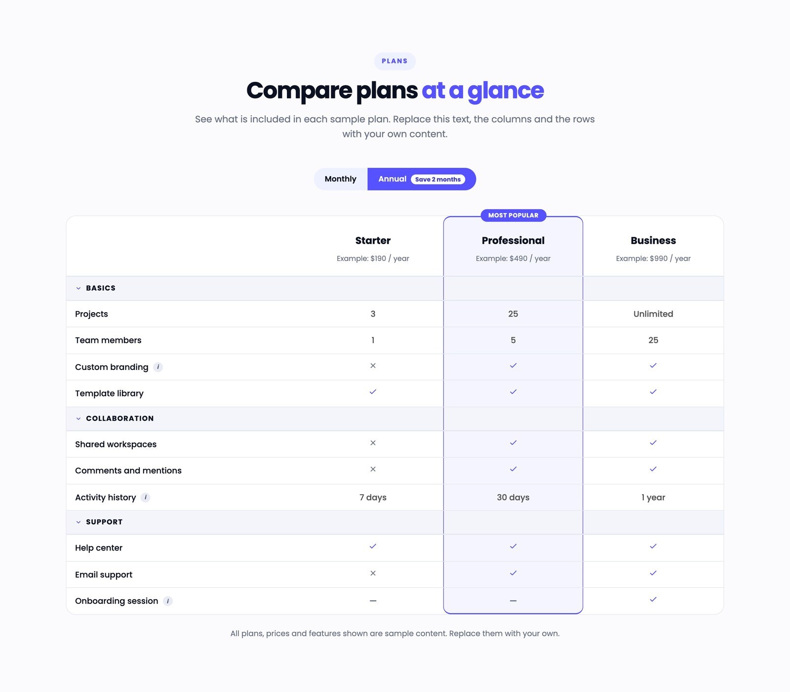
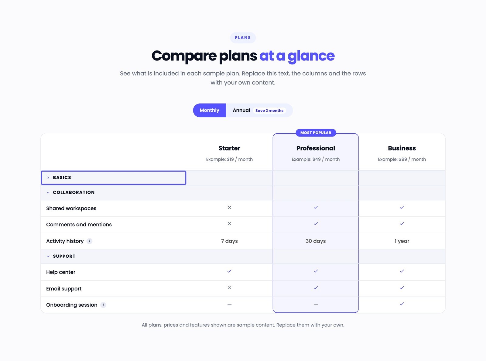
Captures of the same module at tablet and phone widths (Chrome device emulation, not physical devices).