
On this page
A HubSpot CMS module by Avanzia Consulting SRL. This guide explains how to install the module, build the comparison, set monthly and annual links and customize the design.
Overview
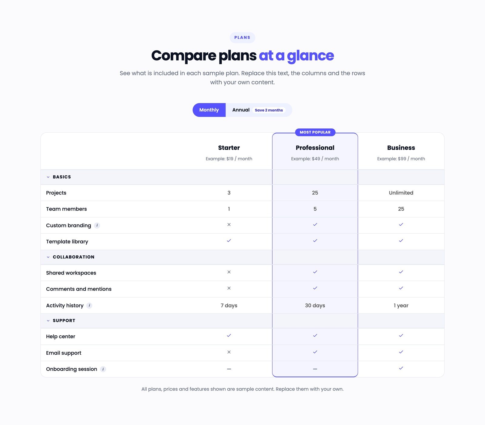
Easy to edit. Built for meaningful comparisons. The module adds a plan or feature comparison table to a HubSpot page. You can add up to 8 columns and as many categories and rows as you need. Each column has a name, a subtitle and its own button with a link, an optional monthly / annual toggle switches the column subtitles and button links, and one or more columns can be highlighted with a colored background, a border and an optional badge.
Rows are grouped into categories that visitors can collapse and expand. Each cell can show a check, a cross, a dash or any text, and each row can have optional help text.
Requirements and compatibility
A HubSpot account that can edit website pages, landing pages or blog templates. No third-party account, no external library. Tested in current Google Chrome (desktop and mobile emulation); other browsers were not part of the tests. The default font (Poppins) is loaded by HubSpot through the font fields and can be changed. If your theme defines a primary color and fonts, the module can follow them.
Price and installation
Price: US$29, one-time purchase. Comparison Table Pro is distributed through the HubSpot Template Marketplace; the link to its Marketplace listing will be published on this page when HubSpot makes the listing public.
After you install it from the Marketplace:
- Open a page in the editor, choose Add module and search for Comparison Table Pro.
- Drag the module where you want the table. You can add it more than once on a page; each copy is independent.
- Replace the sample content with your own columns, categories and rows.
Configuration: content
- Heading and introduction: eyebrow label, heading, highlighted words (type them exactly as written in the heading) and introduction text.
- Monthly / annual toggle: Show monthly / annual toggle adds a switch above the table. Set the period shown first, the button texts, an optional badge on the Annual button (for example a discount note), the alignment and a hidden label for screen readers. Per column you can enter an annual subtitle (for example the annual price) and an optional annual button link. The option Use monthly link as annual fallback (off by default) decides what happens when a column has no annual link (see Good to know). If an annual subtitle is empty, the monthly subtitle is shown for both periods. The toggle changes only the column subtitles and the button links: the values in the rows do not change.
- Columns (plans): up to 8. Per column: name, subtitle, annual subtitle, Highlight this column, Show badge and badge text (only for highlighted columns), header button text, a link, an optional annual link, the new-tab option and style (filled or outline). Links can point to a page or blog post of your site, an external address, a file, an email address or a phone number.
- Categories and rows: each category has a name and an optional icon (HubSpot icon or image). Each row has a feature name, optional help text and one value per column in the same order: text, check, cross or dash.
- Table notes and accessibility labels: scroll hint, a note under the table and the hidden labels read by screen readers (table name, first column, check, cross, dash). Translate them if your page is not in English.
Styling (Styles tab)
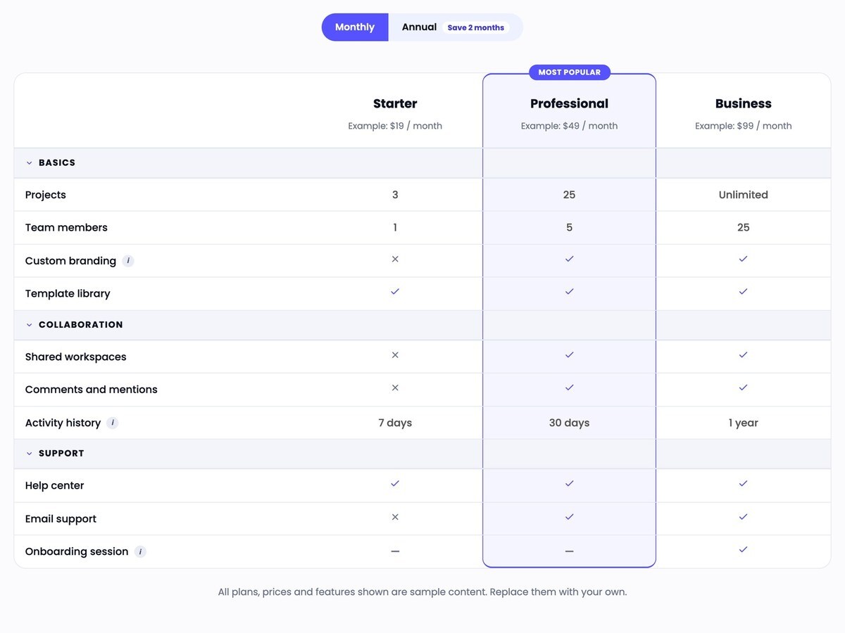
Groups: Text, Section and layout, Table, Column headers, Header buttons, Categories, Highlighted column and badge, Monthly / annual toggle, Icons help and tooltip, Keyboard focus. Fonts, colors, backgrounds, borders, corner radius, spacing, minimum table width, first column width and the keyboard focus color are editable.
Good to know
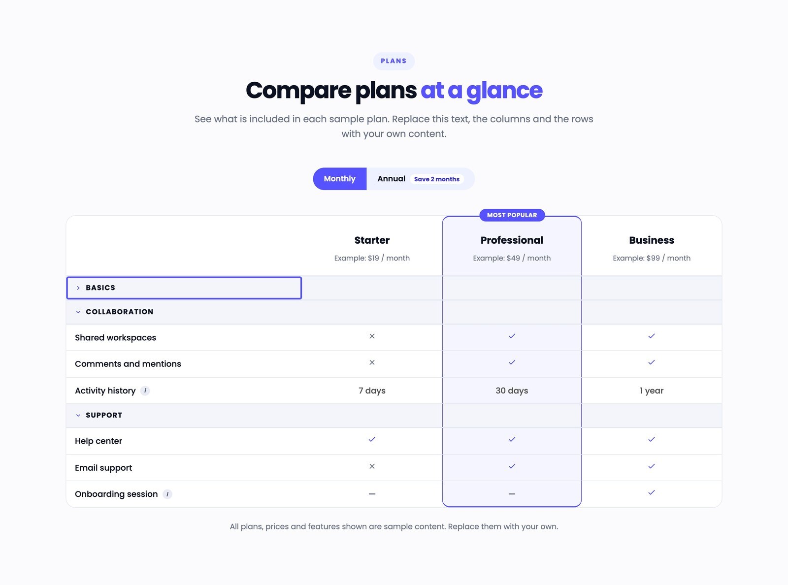
- Every category starts open. Visitors open and close them with the mouse, or with Enter or Space on the category button.
- Help text opens on hover and when the info button has keyboard focus.
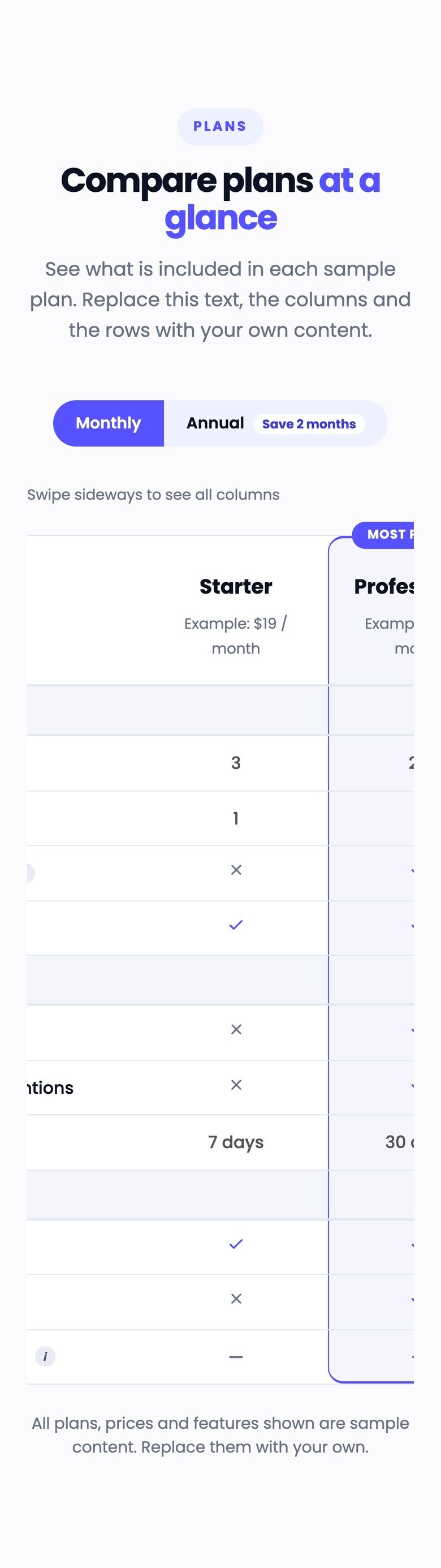
- Under 768 px a scroll hint is shown and the table scrolls sideways inside its own area.
- The toggle is made of two buttons (pressed state is announced to screen readers). Without JavaScript the toggle is hidden and the period chosen in Period shown first stays; all rows stay visible.
- With several tables on one page, each toggle works on its own table.
- Header buttons only appear with a link. A column's header button is shown when it has a link for the selected period and hidden when it does not. A hidden button takes no space, cannot be reached with the keyboard and is not read by screen readers, and the column titles stay aligned. An empty link or a leftover
#counts as no link, so the demo shows no buttons until you add links. - Monthly and annual links. In Monthly the button uses the monthly link. In Annual it uses the annual link when the column has one; an annual link always has priority. When there is no annual link, Use monthly link as annual fallback decides: off (default), the button is hidden in Annual; on, the button stays visible and uses the monthly link. A column that has only an annual link shows its button only in Annual. If the toggle is switched off, only the monthly link is used. This option never changes the links you entered.
- The demo content (plans, prices, features) is sample text: replace it.
Responsive behavior
Below 768 px wide a scroll hint is shown and the table scrolls sideways inside its own area. If the table scrolls sideways on a large screen, lower Table minimum width in Styles or use fewer columns.
Accessibility
Real table with column and row headers and a caption; category and help controls are buttons; check, cross and dash have text labels for screen readers; badge text is read with the column name; visible focus outline (color editable); reduced-motion support. If you change colors, check the contrast of your own choices.
Troubleshooting
- A cell is empty or missing: each row needs one value per column. Add or remove values so the count matches the columns.
- The toggle changes the prices but not a row value: the toggle only switches the column subtitles and button links. For a value that differs by period, write it in the row text or use a second table.
- The annual price does not appear: fill Column subtitle: annual in each column; when it is empty the monthly subtitle is shown for both periods.
- A column's button is missing: add a link in that column (Header button: link). In Annual, add an annual link too, or turn on Use monthly link as annual fallback to reuse the monthly link. Also check that Show header button is on and the button text is filled.
- The badge does not show: turn on Highlight this column first, then Show badge.
- Highlighted words are not colored: they must appear exactly in the heading, with the same capitals and spaces.
- The table scrolls sideways on a large screen: lower Table minimum width in Styles, or use fewer columns.
- My theme changes the look of the table: the module styles are scoped to each instance. A theme that forces its own rules with
!importanton tables, links or buttons can still override them; adjust the theme or the module's Styles.
Support
Avanzia Consulting SRL handles reports of errors in this module, that is, cases where it does not work as described in this guide, in line with the obligations that apply to Marketplace listings. Write to hola@weareavanzia.com and include the page address, your browser, the steps to reproduce the problem and, if possible, a screenshot.
Support does not include custom changes or personalization of the module, setup work on your site, or general support. No response times are guaranteed, and no future features are promised.
Last updated: November 16, 2026.