On this page
- Overview
- Installation
- Compatibility
- Add people and edit content
- Choose a layout
- Six card styles
- Photos and photo shapes
- Profile modes
- The profile pop-up
- Individual profile links
- Department filters
- Typography
- Colors
- Spacing and responsive behaviour
- Accessibility
- Known limitations
- Troubleshooting
- Support
Team Spotlight Pro is a HubSpot CMS module by Avanzia Consulting SRL. Three distinct layouts. Six card styles. One intuitive team showcase. This guide covers setup, every editor option and the known limitations.
Overview
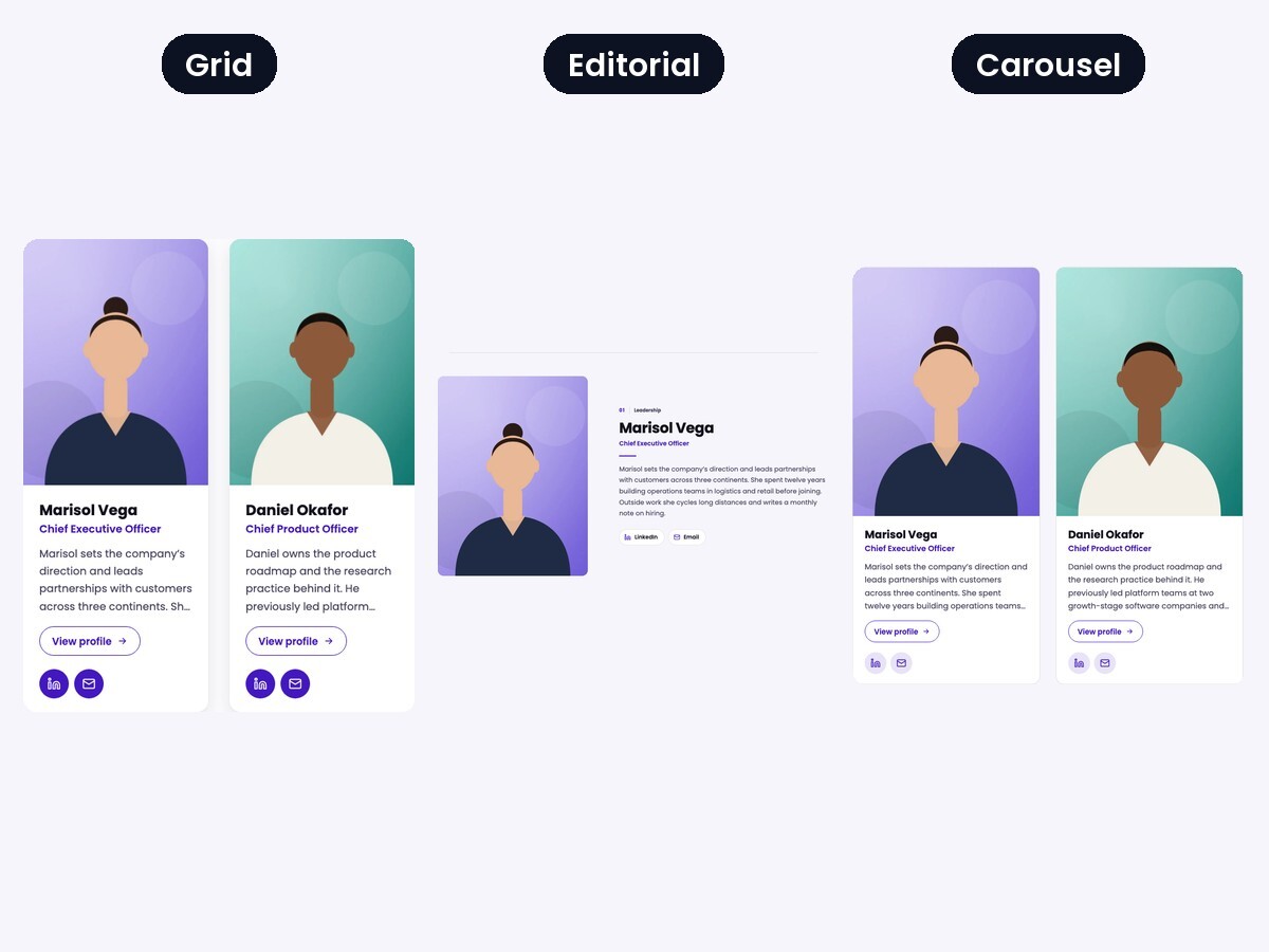
Team Spotlight Pro shows your team as a Grid of cards, an Editorial layout of large alternating rows, or a swipeable Carousel. Each person has a photo, name, job title, department, biography and optional LinkedIn, email, phone and extra links. You choose what happens when a visitor selects a person: show everything on the card, open a profile pop-up, or link to a page you already have. Grid layouts can offer department filters.
All examples in this guide use fictitious demo people and illustrated portraits.
Installation
- Install Team Spotlight Pro from the HubSpot Marketplace into your account.
- Open a page, landing page or template in the HubSpot editor.
- Open the module picker (the plus icon), find Team Spotlight Pro and add it to a drag-and-drop area or a module-enabled template.
- The module starts with six sample people (initials instead of photos). Replace them with your own.
Compatibility
- Checked: HubSpot website pages and landing pages, and a blog post template that contains the module, all in a HubSpot portal on draft pages. Tested in current Google Chrome (desktop and mobile device emulation).
- Blog posts: the module can be placed in a blog post template. It cannot be dragged into the body of a single post.
- Not verified: Safari, Firefox, real mobile devices, screen readers and third-party themes. The module is built to inherit your theme fonts and primary color and to isolate its own styles, but compatibility with a specific theme has not been tested.
- The profile pop-up uses the browser's native dialog element (Safari 15.4 or newer).
Add people and edit content
Open the Content group. At the top are the label above the heading, the heading, the words to highlight, the subtitle and the heading level. Leave a text field empty to hide it. Below them is the Team members list.
- Add: select + Add. A new person is created with placeholder text.
- Edit: select the pencil icon of a person. The list shows each person by name.
- Reorder: drag the handle at the left of a person. Select Apply changes if the editor asks for it.
- Duplicate or delete: use the icons that appear when you point at a person.
Each person has: photo, name, job title, department, biography, LinkedIn, email, phone, an extra link with its own text, and a profile page link. Contact buttons for empty fields are not shown. A module holds up to 30 people.
Choose a layout
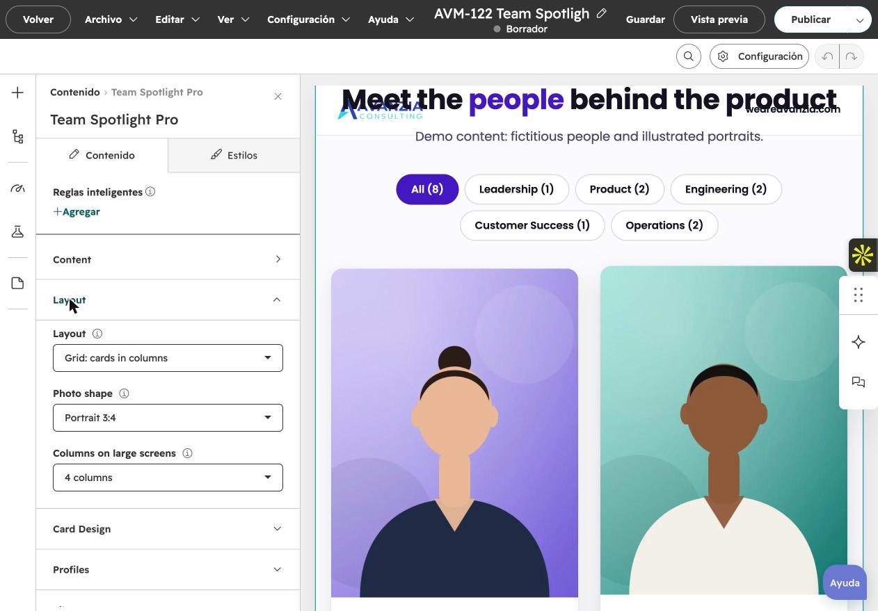
In Layout choose Grid, Editorial or Carousel. Your content and settings stay in place when you switch. Options that do not apply to the chosen layout are hidden, not deleted.
- Grid: 2, 3 or 4 columns on large screens (two on tablets, one on phones).
- Editorial: large rows that alternate photo and text, with room for the full biography. Row density can be Compact (two people per row) for teams of seven or more.
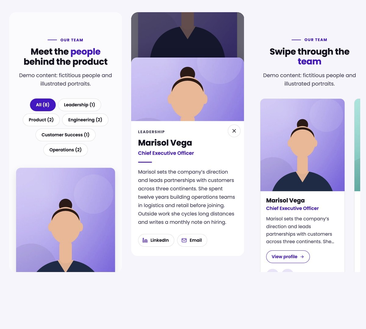
- Carousel: 2, 3 or 4 cards visible on large screens (two on tablets, one with a peek of the next card on phones), optional position dots, arrows, touch swiping and keyboard support. There is no autoplay.
Six card styles
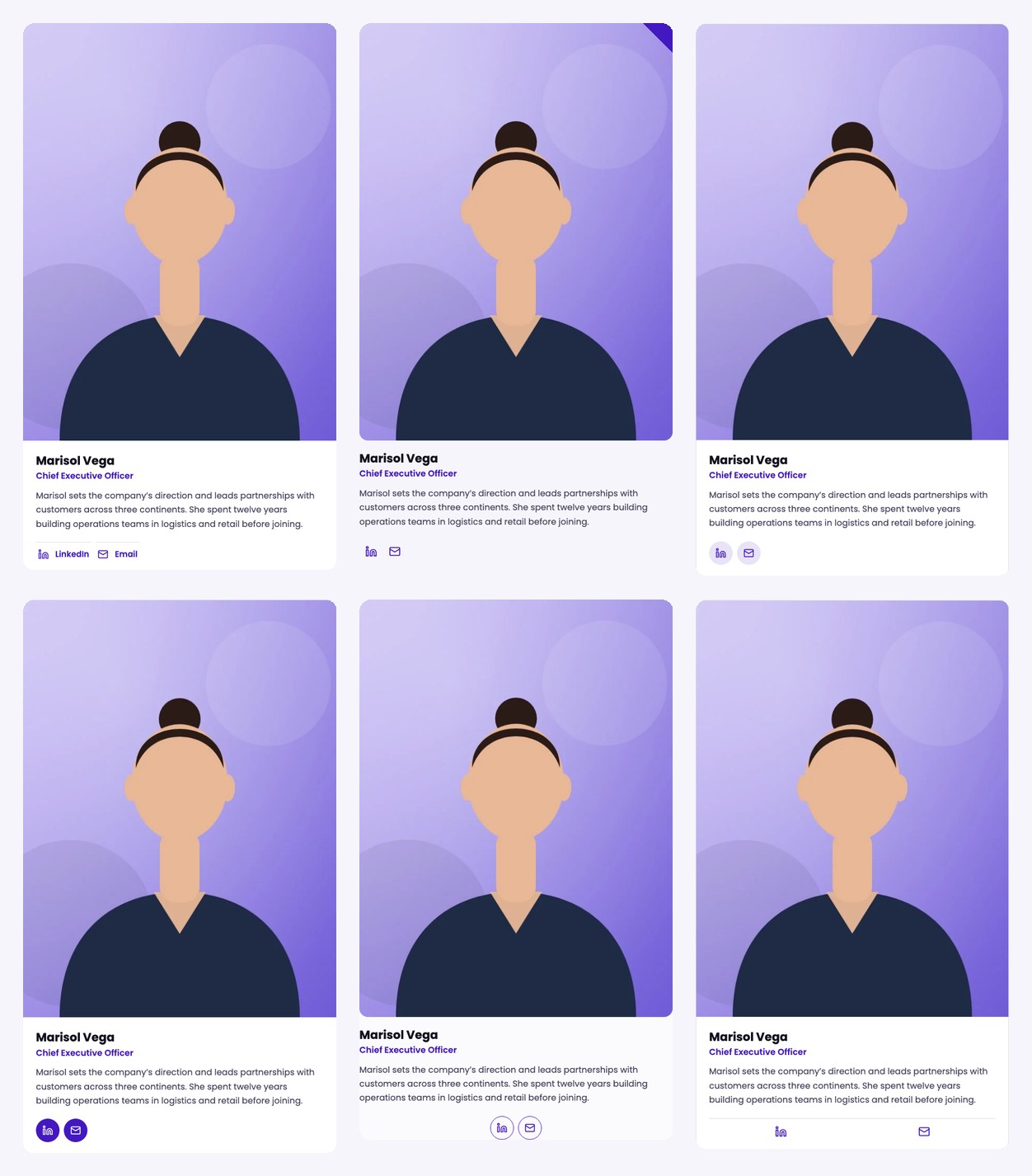
In Card Design choose one of six styles for Grid and Carousel (Editorial has its own design, so this group is hidden there):
- Shadow card with text links
- Open layout with an accent corner
- Bordered card with light icon circles
- Shadow card with accent icon circles
- Open layout with centred outlined icons
- Bordered card with distributed icons
Photos and photo shapes
Upload a photo for each person. In Layout choose the Photo shape: Portrait 3:4, Square 1:1 or Wide 16:9. Photos are cropped to the shape and keep the upper part of the image, so wide crops work best with photos where the face sits near the top. Photos are served in several sizes and the first row loads immediately.
A person without a photo shows initials. Add alternative text in the image field if the photo carries meaning; leave it empty when the name next to it already says who it is.
Profile modes
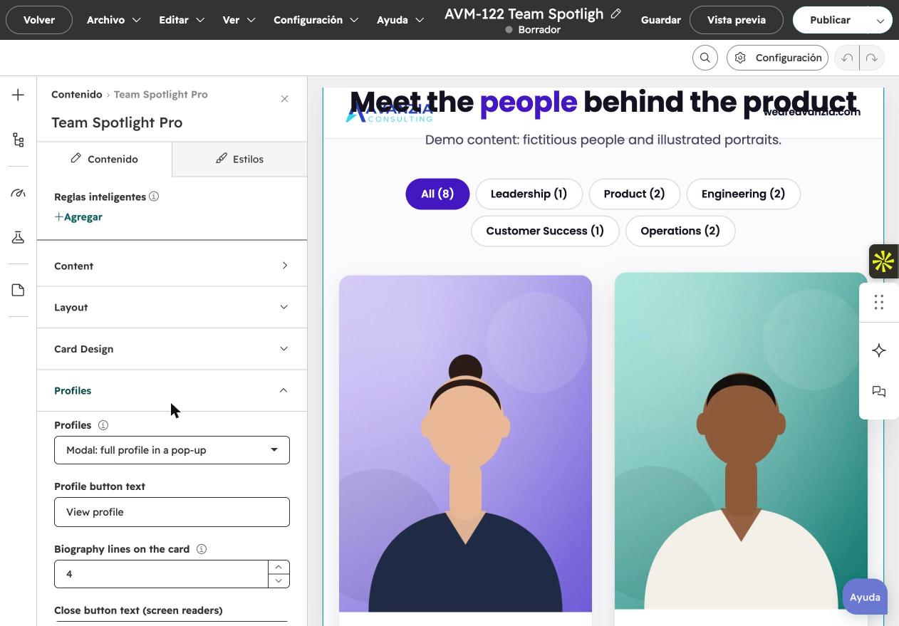
In Profiles choose what happens for each person:
- Simple: everything is on the card, with the full biography.
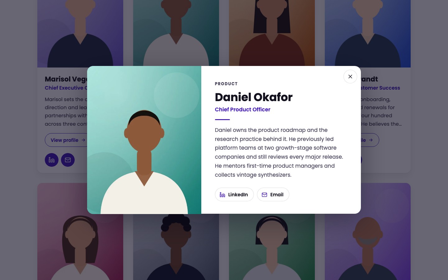
- Modal: the card shows an excerpt and a button (default text View profile). The button opens a pop-up with the photo, department, name, job title, full biography and contact buttons.
- Link: the card shows an excerpt and a button that opens the page you set in the person's Profile page field. People without a profile page show no button.
With Modal or Link you can set how many lines of the biography the card shows (2 to 8, default 4). Nothing is cut from your content: the full text appears in the pop-up or on the linked page. In Editorial the biography is always shown in full, so Modal behaves as Simple there.
The profile pop-up
The pop-up uses the browser's native dialog. It opens from the button, moves keyboard focus into the pop-up, keeps the page behind it inactive, closes with Escape, the Close button or a click outside, and returns focus to the button that opened it. On phones it appears as a sheet at the bottom of the screen and scrolls inside if the biography is long. Several modules on one page work independently.
Individual profile links
With Profiles set to Link, add the page address in each person's Profile page field (a page of your site or an external address). The field appears only in Link mode. Team Spotlight Pro does not create individual pages for you.
Department filters
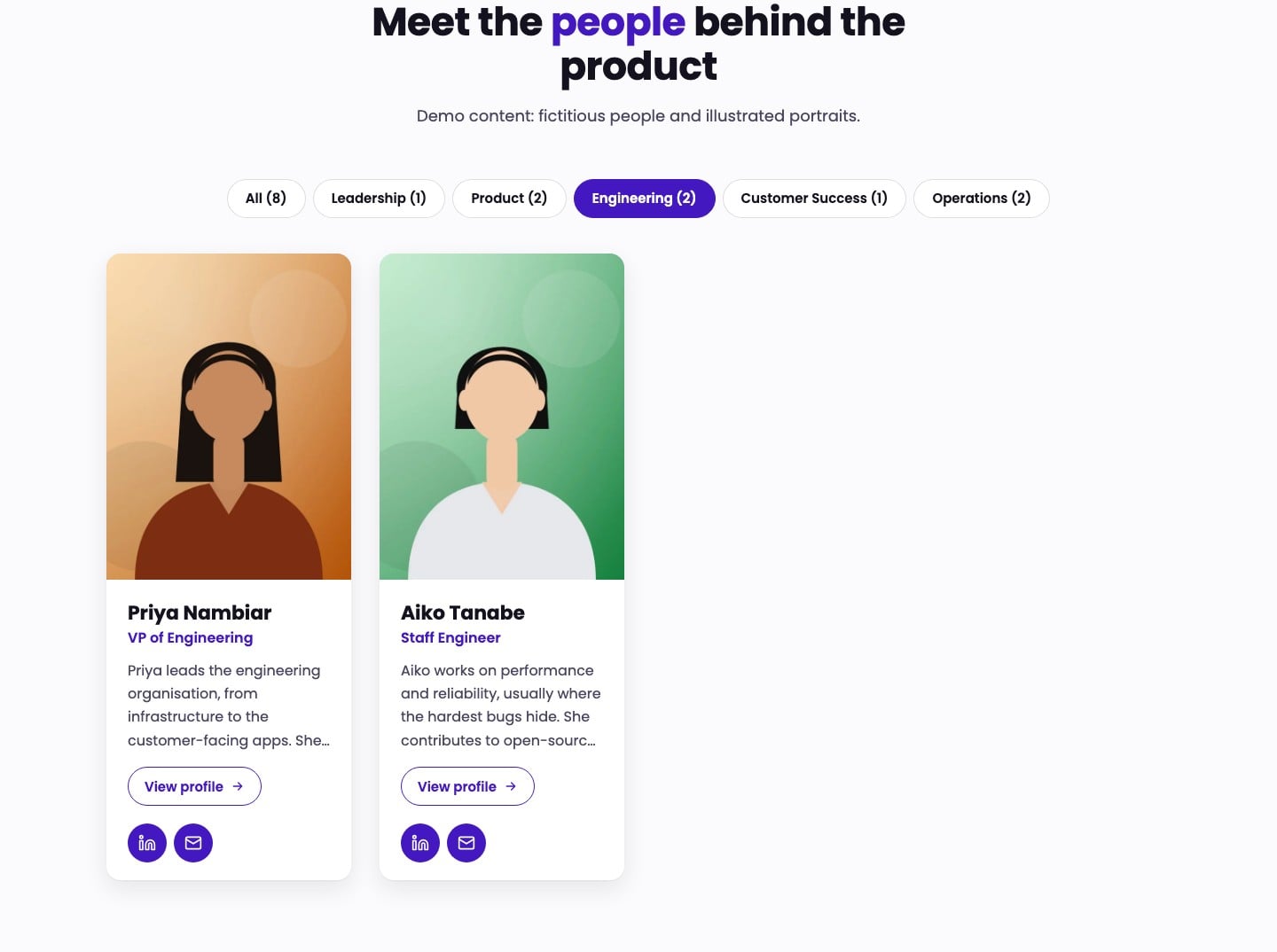
In Filters (Grid layout only) turn on Show filters. Fill the Department field of each person with the same spelling for people in the same department. The module builds one button per department, plus an All button, with the number of people in each. Choosing a button hides the other cards and announces the result to assistive technology.
Filters appear only when there are at least six people and at least two departments, so small teams never see needless controls. You can edit the group label, the text of the All button and the announcement (use {shown} and {total}).
Typography
In the Styles tab, Typography sets the heading and name font and the text font. By default both follow your theme. Only the font family is used; sizes and weights follow the design so layouts stay consistent.
Colors
Colors sets the section background (transparent by default), accent color (follows your theme's primary color), strong text, secondary text and card background. Text on accent surfaces switches between white and dark automatically. The default palette meets the contrast ratios checked in testing; if you choose a very light accent or low-contrast text colors, check the contrast yourself.
Spacing and responsive behaviour
Spacing sets the section spacing, maximum content width (default 1200 px), the gap between cards and the corner radius. The module adapts to the screen: Grid shows two columns below 1024 px and one below 640 px; Carousel shows two cards on tablets and one with a peek of the next on phones; Editorial stacks photo and text below 820 px. Nothing scrolls sideways on the page.
Accessibility
- Cards, buttons, filters, carousel controls and the pop-up can be used with the keyboard; focus is always visible.
- Icon buttons and links include the person's name in their accessible label.
- Touch targets are at least 24 px, and the main controls 44 to 48 px.
- Motion is reduced when the visitor's system asks for it; the carousel never plays automatically.
- The default colors were checked for contrast. An automated scan (axe-core, WCAG A and AA rules and best practices) found no violations on the test pages.
- Not verified: screen readers and manual testing with assistive technology. This is not an accessibility certification.
Known limitations
- Interface labels (LinkedIn, Email, Phone, Previous, Next, Go to page) are in English only.
- The profile pop-up is not available in Editorial.
- Filters work in Grid only and need at least six people in two departments.
- Up to 30 people per module.
- A very light accent color can reduce text contrast.
- A theme that forces its own rules with !important on headings, lists or links can override the module's styles.
Troubleshooting
- No filters: check that the layout is Grid, Show filters is on, and there are at least six people in two or more departments with matching spelling.
- No profile button in Link mode: the person has no Profile page address.
- Photos look cropped: choose another Photo shape or a photo with the face near the top.
- An option is missing: options appear only for the layout and profile mode you chose; switch back and they are still there.
- Text looks different from the demo: the module follows your theme fonts; set the fonts in Styles to change them.
Support
Avanzia Consulting SRL handles reports of errors in this module, meaning cases where it does not work as described in this documentation. Write to hola@weareavanzia.com with the page address and a description of the problem. Support does not include custom changes, setup work on your site or general support. No response times are guaranteed and no future features are promised.
November 2026